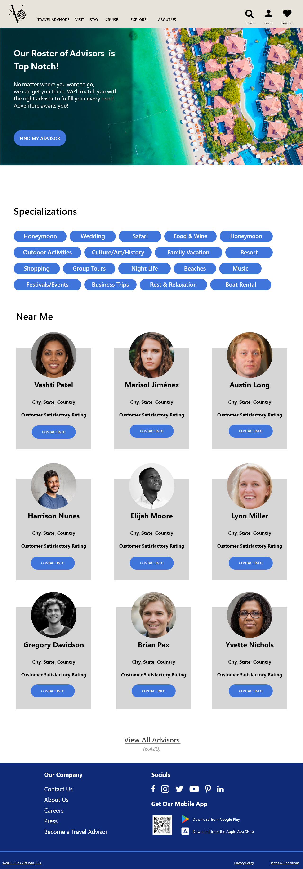
Logo Redesign
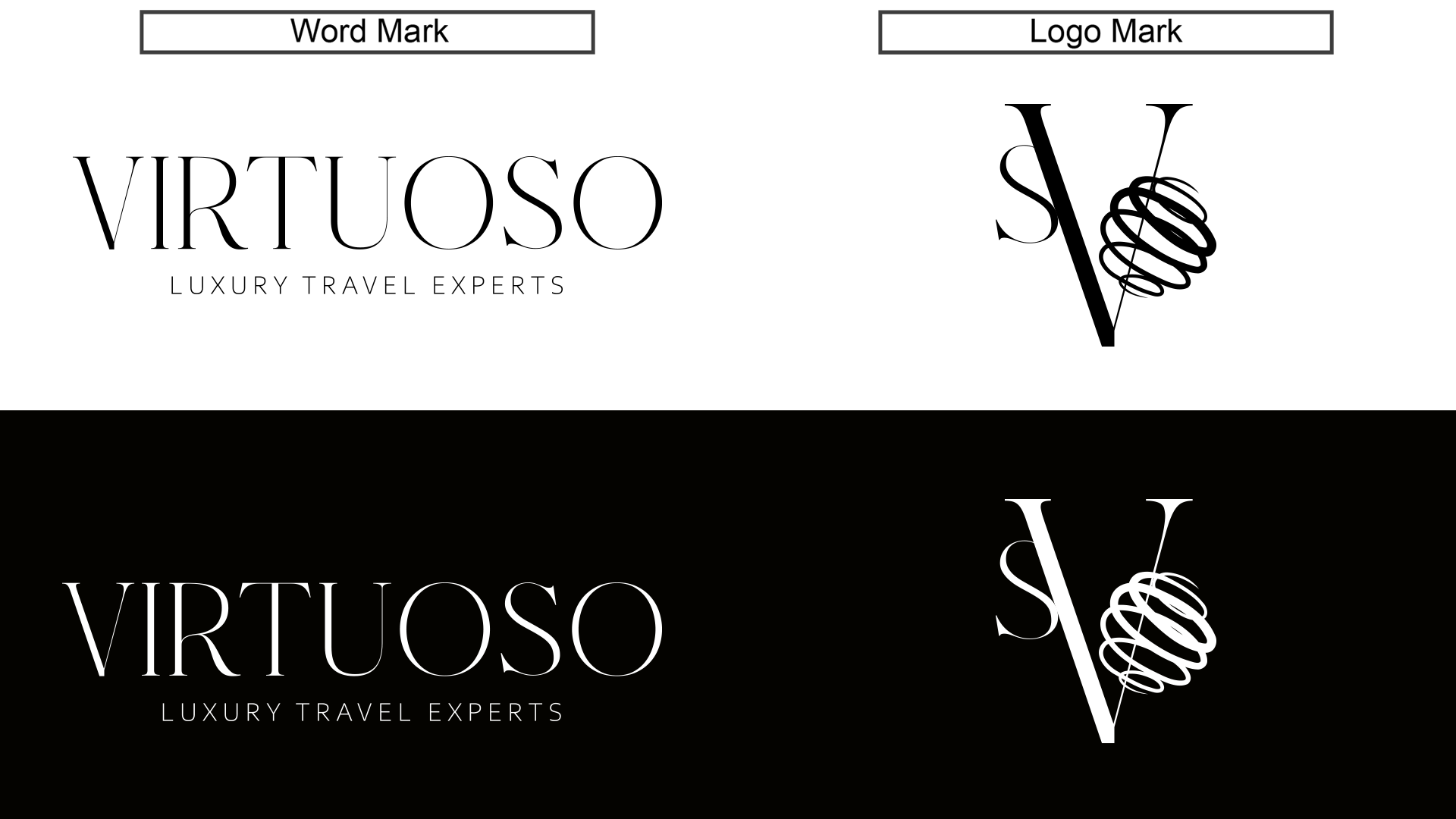
Word Mark - I kept the word mark simple and elegant. I wanted a serif font just like in the original mark, but went for a typeface with a more slender line weight and taller, slightly more stylistic characters.
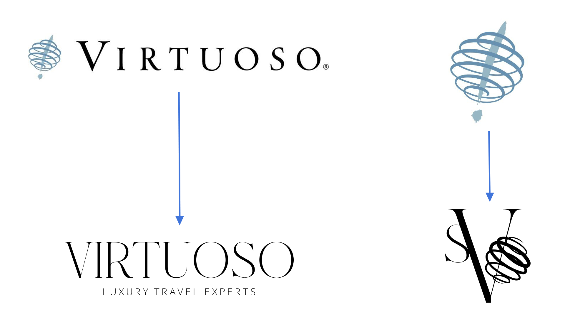
Logo Mark- I wanted something more sophisticated. As a business, Virtuoso services a high earning demographic. I want the logo to help sell the luxuriousness of the Virtuoso travel experience. To lean into that elegant feeling, I opted for a letter mark utilizing the letters V,S,and O. The logo is composed so as to draw the eye the V in the center, and then the entire composition as one cohesive piece. I really liked the swirl in the original logo because it feels active and provides a sense of movement, so I utilized that graphic element to represent the "o" in virtuoso.
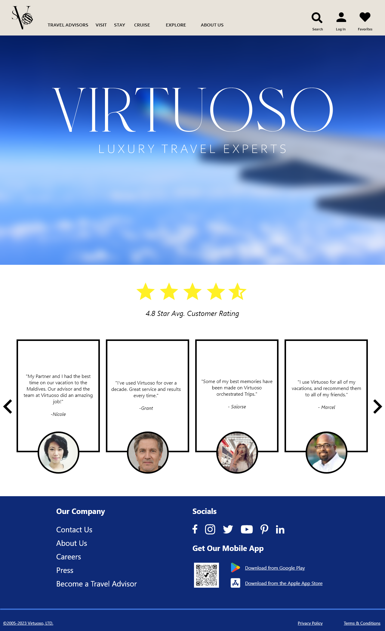
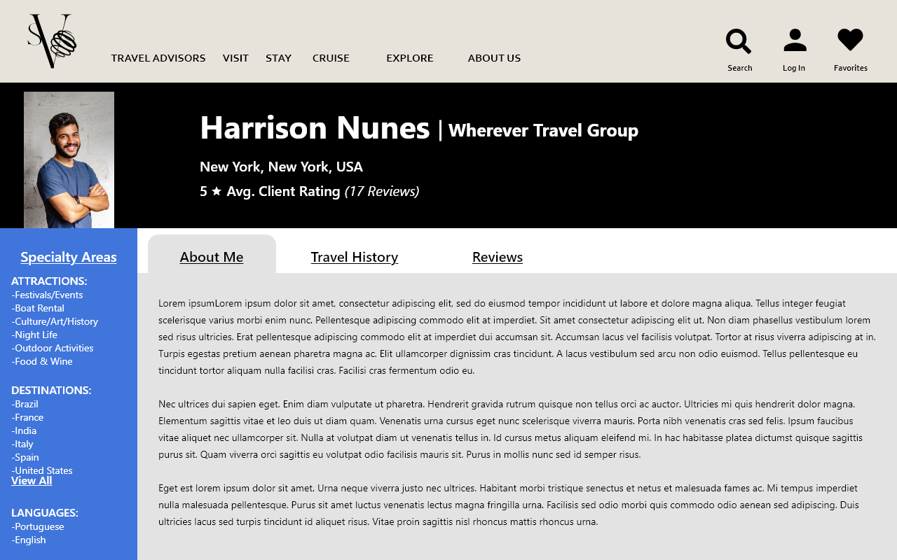
Web Design
Play around on the site yourself at https://xd.adobe.com/view/eceeb80c-4d1a-4ba2-870e-8132833eda14-b9bd/?fullscreen&hints=off
*Note* Not every page and/or button is fully interactive. This is a prototype!

Commercial
Programs Used
Credits:
Stock images and video courtesy of https://www.pexels.com/
Individual Contributors:
Ron Lach, RDNE Stock project, August de Richelieu, Yaroslav Shuraev, cottonbro studio, Kelly, Kampus Production, Taryn Elliott, Andi Farruku, Mikhail Nilov, Pixabay, James Wheeler, Antony Trivet, mali maeder, Paul Deetman, Silvia Trigo, LUNA LUNA, jimmy teoh, Abbas Mohammed, Işıl, The Lazy Artist Gallery