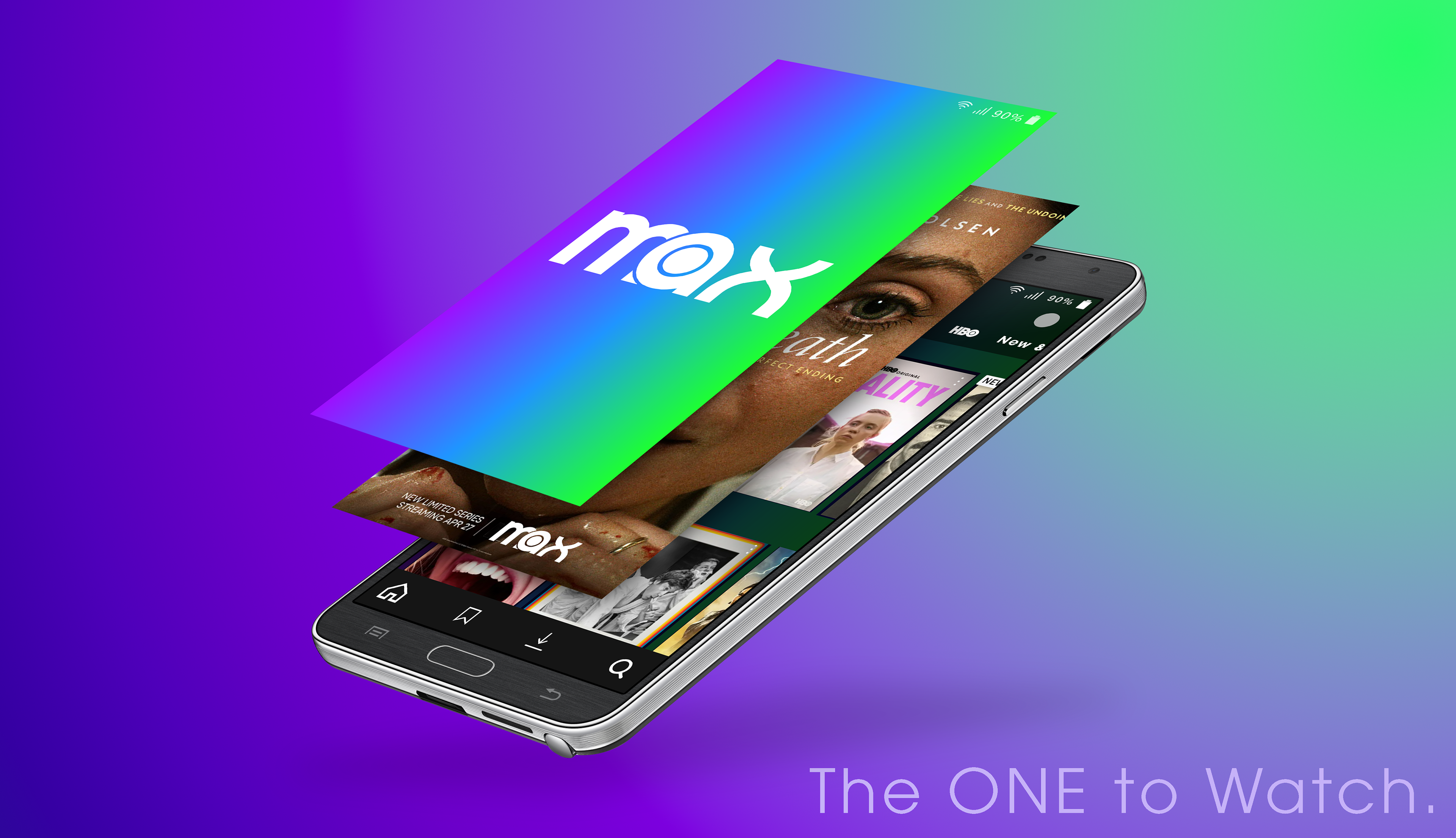
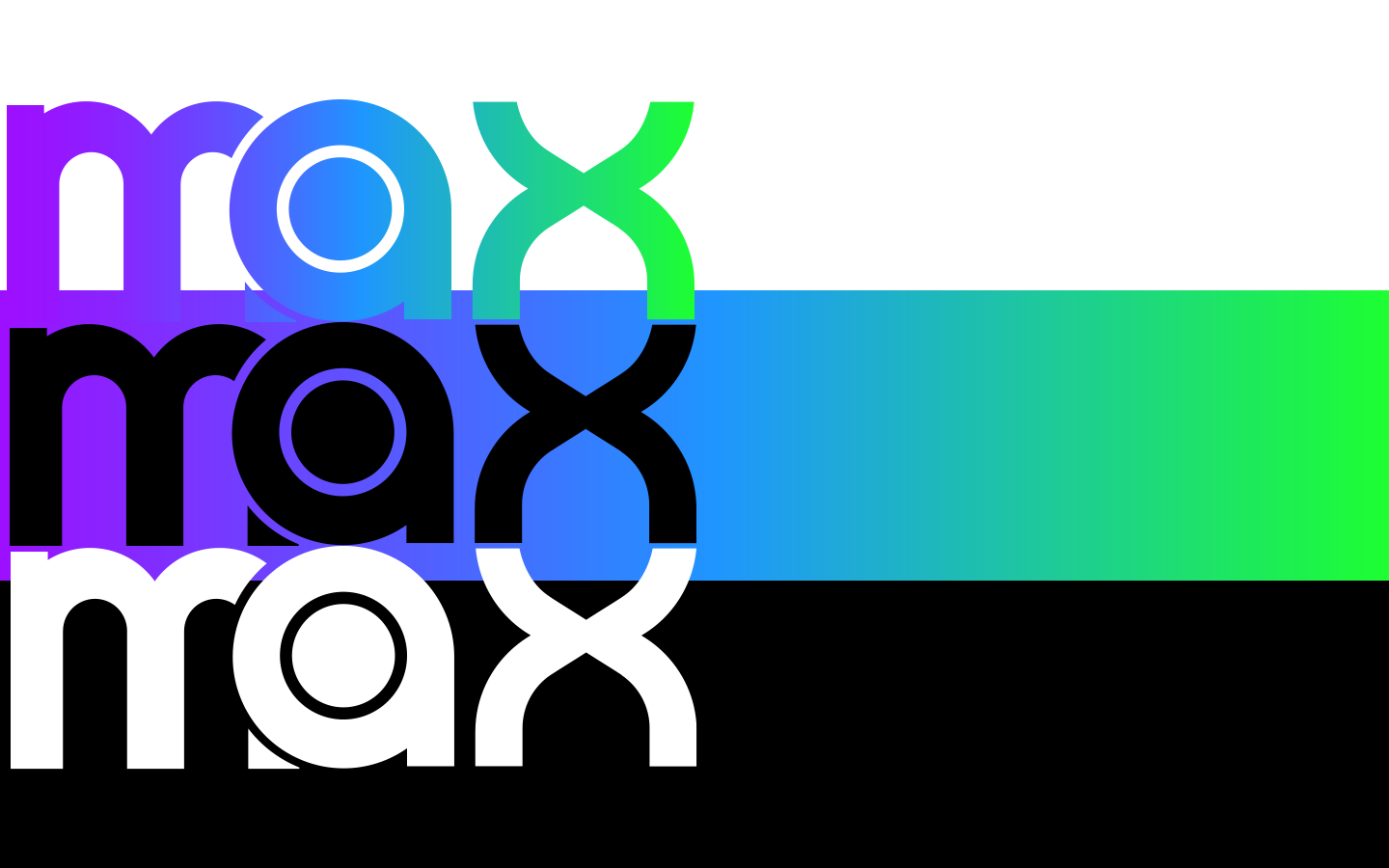
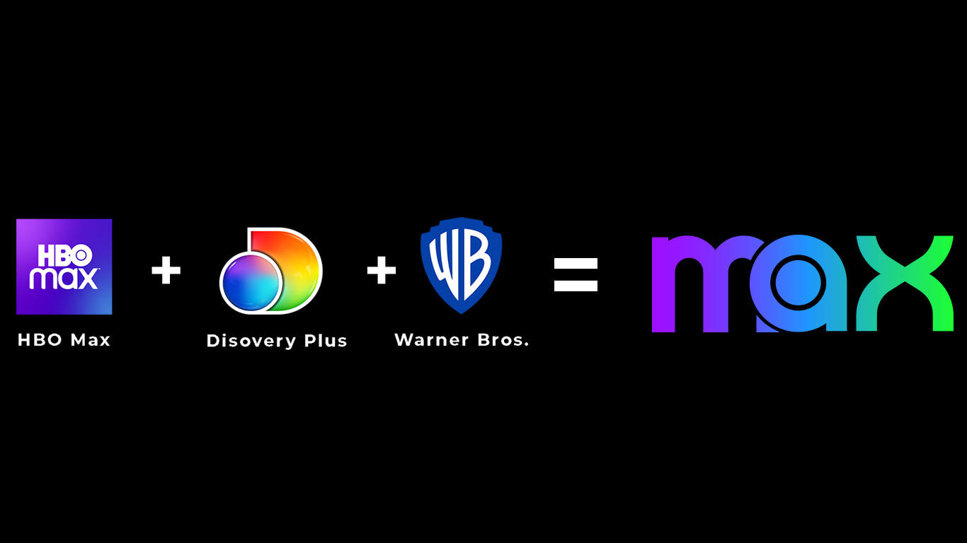
The key to the "Max" logo in my eyes is simplicity, and recognizability while still offering something fresh. It wants to have the same feel as the HBO Max logo so users feel like they're still using a service and a brand they recognize and trust. At the same time it needs to have its own presence. I wanted to make sure I pulled from the design of each media company/ streaming service that came together to bring us "Max." The actual logo the company landed on fell a bit flat in this area, so I wanted to pay special attention to that in my design. The font weight and text style remind us of HBO Max which is the most necessary thing. Beyond that the overlapping of the "a" and "m" is a nod to the overlap present in the Discovery Plus logo. The negative space in the "x" comes to a spade-like point to resemble Warner Brothers' shield emblem. The colors were chosen to further incorporate all of the collaborating companies and yet give max its own fresh identity. HBO Max also utilized ombre between shades of blue, purple, and pink within the interface of the website and application. That was one of my favorite elements of the interface and I wanted to keep that element and even heighten it in this new branding.
Programs Used
Credits:
Mockup template courtesy of: <a href="https://www.freepik.com/free-psd/mobile-phone-mock-up-design_1016576.htm#query=phones%20mockup&position=43&from_view=search&track=robertav1_2_sidr">Image by ydlabs</a> on Freepik
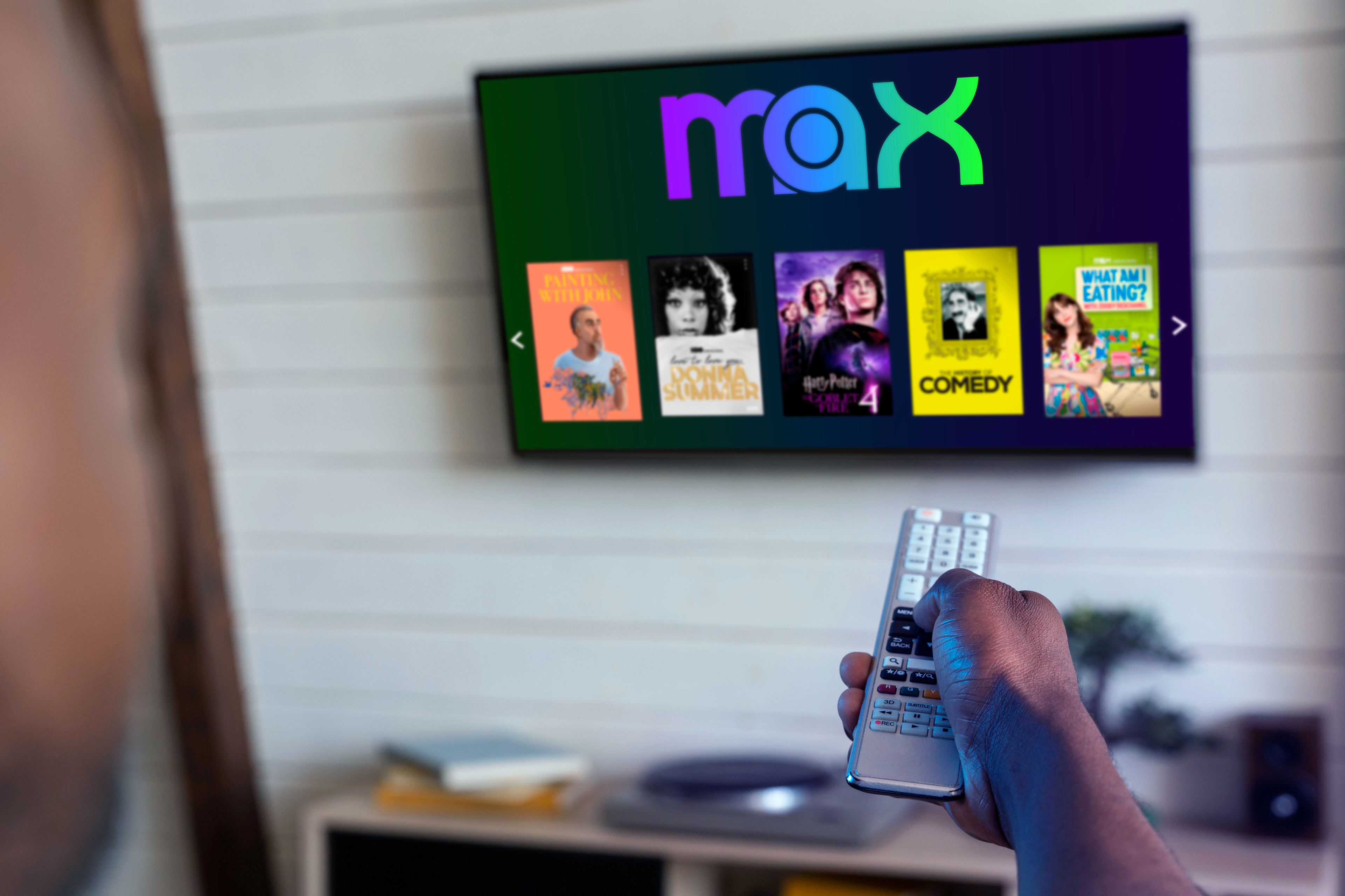
Image Courtesy of: <a href="https://www.freepik.com/free-photo/man-changing-film-streaming-service_16137502.htm#page=2&query=television%20mockup&position=41&from_view=search&track=robertav1_2_sidr">Freepik</a>